Rito Mobile App
Refining skills in Figma components and prototyping.
Rito is a mobile app that contains information about various hiking trails in Sagada, Mountain Province in the Philippines.
The app equips traveler’s with information that will allow them to better prepare for their trip and plan accordingly. It provides safety information, hiking distance, difficulty, and duration for each trail. Rito will also provide the weekly weather forecast for the province.
☞
Optimized navigation and interface design.
An astute understanding of components and prototyping tools in Figma.
☞
Prototype
figma.com/rito
UX/ UI, Branding
2023
Branding
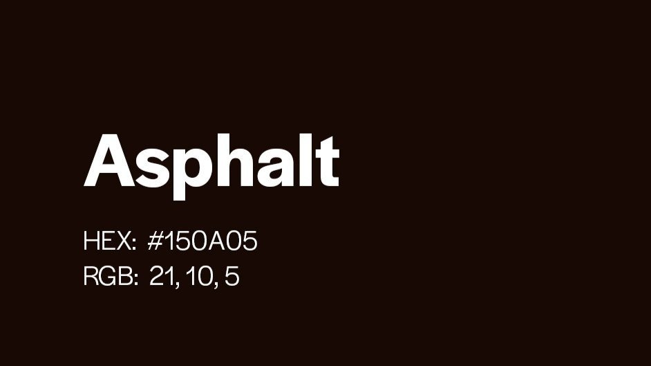
Rito’s branding takes into account the urgency its intended users demands. A warm color palette is used with a bright orange as the main color as it is highly associated with safety and caution as seen in construction signs, cones, etc..
The Logo
Rito is a Tagalog word for ‘here’ which speaks to the purpose and goal of the app. Intended as a navigational software that guides Sagada hikers through its numerous trails, Rito’s logo takes a funkier and livelier design, emulating the vibrance of the Filipino culture.
Learningsッ
I had a pretty good understanding of what I wanted to achieve with the app from the get-go. I feel like that’s what really guided me throughout the process. It’s important to nail down the design rationale before working on the app – so that when I hit a wall, I can always go back to it to reorient myself.
Future development
Adding more interactive features in the app, like a live map, a weather feature that updates in real time, and perhaps a section where users can give their own thoughts and reviews on the trails would be cool.
Softwares


